What is Web Designing? | Web Design Vs. Web Development
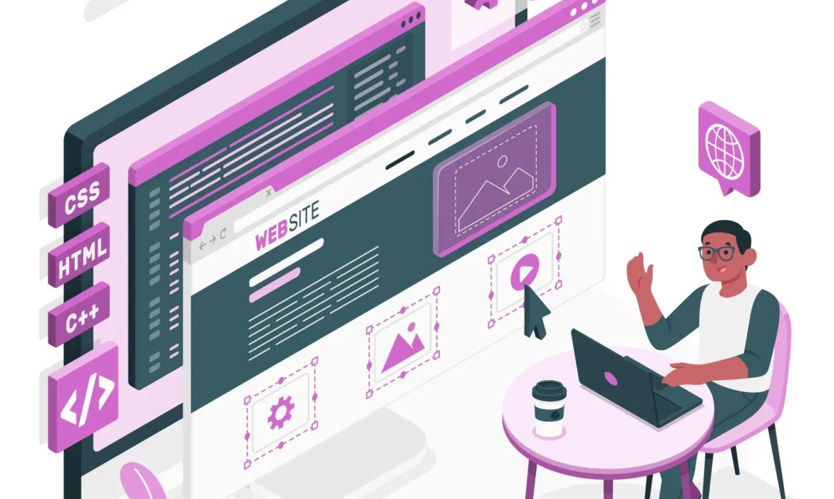
Web designing refers to the process of creating websites. It encompasses various aspects including layout, content production, graphic design, and user experience (UX) design. Web designers utilize different tools and technologies to bring a website to life on the internet.
What you’ll learn in this guide:
- What is Web Designing?
- What Do Web Designers Do?
- Key Benefits of Having a Good Web Design
- Key Elements of Web Design
- Web Design Vs. Web Development
- What Are the Different Web Design Tools?
- What is Responsive Web Design?
- Website layouts
- Functional components of web design
- Visual elements of web design
- Website maintenance
- Web design inspiration
What is Web Designing?
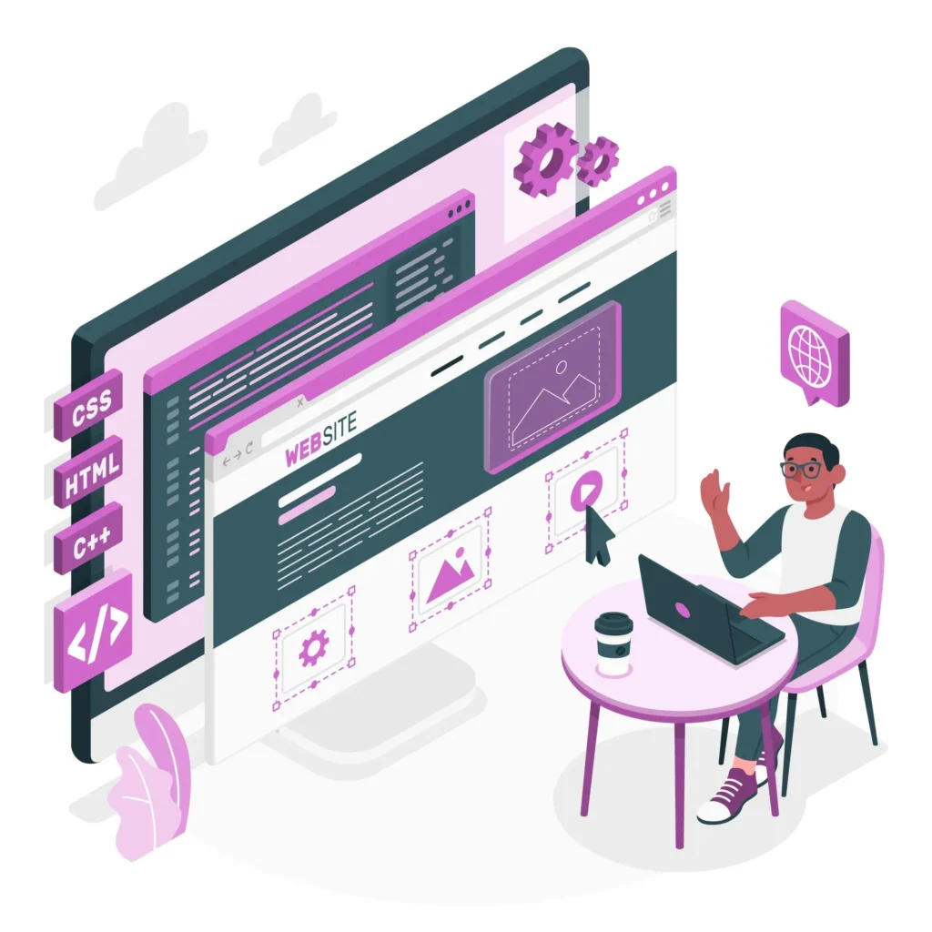
Web designing is a multifaceted discipline that involves the creation and maintenance of websites. It encompasses a wide range of skills and techniques aimed at producing visually appealing and user-friendly websites.
Let’s delve deeper into the various aspects of web designing:
Understanding the Role of Web Designers
Web designers play a crucial role in crafting the visual aspects of a website. Their responsibilities extend beyond just aesthetics and involve considerations for usability, accessibility, and user experience.
Here are some key aspects of what web designers do:
- Layout Design: Web designers decide how the elements of a webpage should be arranged to create a cohesive and intuitive layout.
- Color Theory: They choose color schemes that reflect the brand identity and evoke the desired emotions in website visitors.
- Typography: Selecting appropriate fonts and font sizes to enhance readability and convey the right tone and message.
- Graphic Design: Incorporating graphics, icons, and other visual elements to complement the content and improve engagement.
- User Experience (UX) Design: Ensuring that the website is easy to navigate, intuitive to use, and provides a positive overall experience for visitors.
Key Components of Web Design
Successful web design requires attention to various components that collectively contribute to the effectiveness of the website.
Here are some essential elements of web design:
1. Layout:
- Determining the arrangement of content, navigation menus, and other elements on each webpage.
- Choosing between different layout types such as fixed, fluid, or responsive layouts based on design requirements and user preferences.
2. Visual Elements:
- Selecting images, videos, icons, and other visual elements that enhance the aesthetic appeal and convey information effectively.
- Ensuring consistency in visual style and branding throughout the website.
3. Functionality:
- Incorporating functional components such as forms, buttons, sliders, and interactive elements that enable users to interact with the website seamlessly.
- Prioritizing usability and accessibility to accommodate users with different needs and preferences.
Web Design Process and Tools
The process of web design typically involves several stages, from initial planning and conceptualization to implementation and maintenance. Throughout this process, web designers utilize various tools and technologies to streamline their workflow and achieve desired outcomes.
Here are some common web design tools:
Design Tools:
- Adobe Photoshop
- Adobe XD
- Sketch
- Figma
- InVision
Development Tools:
- HTML
- CSS
- JavaScript
- Content Management Systems (e.g., WordPress, Drupal)
Adapting to Modern Trends
Web design is an ever-evolving field, with new trends and technologies emerging constantly. One of the most significant trends in recent years is the shift towards responsive web design, which ensures optimal viewing and interaction experiences across various devices and screen sizes.
Additionally, there is a growing emphasis on accessibility, performance optimization, and sustainability in web design practices.
What Do Web Designers Do?
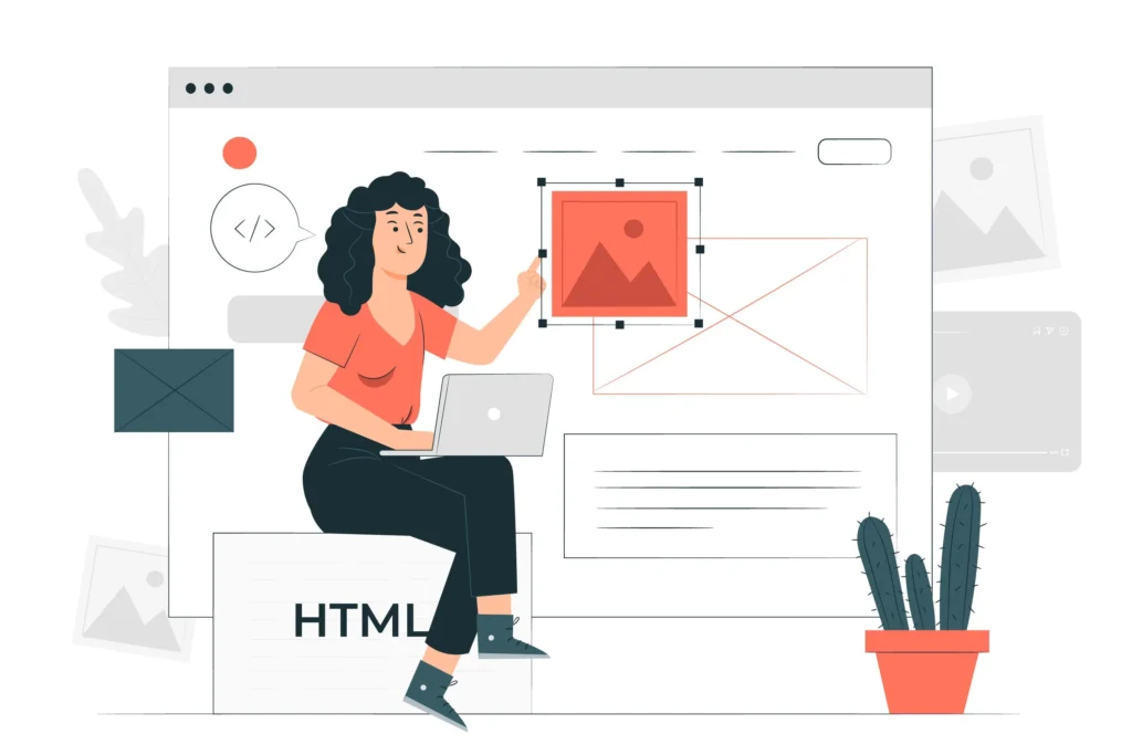
Web designers play a crucial role in creating visually appealing and user-friendly websites. Their responsibilities extend beyond just aesthetics and involve various tasks aimed at delivering a positive user experience.
Let’s delve deeper into the specific duties and skills of web designers:
1. Designing Layouts and Interfaces
1.1 Layout Design:
- Web designers are responsible for creating the overall layout of a website, including the arrangement of text, images, and other elements on each page.
- They consider factors such as visual hierarchy, balance, and symmetry to create a cohesive and visually pleasing layout.
1.2 User Interface (UI) Design:
- UI design focuses on the design of interactive elements such as buttons, forms, and navigation menus.
- Web designers ensure that these elements are intuitive to use and visually consistent with the overall design scheme of the website.
2. Choosing Colors, Fonts, and Visual Elements
2.1 Color Theory:
- Web designers select color schemes that reflect the brand identity and evoke the desired emotions in website visitors.
- They consider factors such as contrast, harmony, and accessibility when choosing colors for various elements of the website.
2.2 Typography:
- Selecting appropriate fonts and font sizes to enhance readability and convey the right tone and message.
- Web designers may also incorporate custom typography to create a unique visual identity for the website.
2.3 Graphics and Visual Elements:
- Incorporating graphics, icons, images, and other visual elements to complement the content and improve engagement.
- They ensure that visual elements are optimized for web display and enhance the overall aesthetic appeal of the website.
3. Enhancing User Experience (UX)
3.1 Usability Testing:
- Web designers conduct usability testing to evaluate the effectiveness of the website design in meeting user needs and expectations.
- They identify areas for improvement and make necessary adjustments to enhance the overall user experience.
3.2 Accessibility:
- Ensuring that the website is accessible to users with disabilities by adhering to web accessibility standards (e.g., WCAG).
- Web designers incorporate features such as alternative text for images, keyboard navigation, and semantic HTML to improve accessibility.
4. Collaborating with Web Developers and Stakeholders
4.1 Communication:
- Web designers collaborate closely with web developers, content creators, and other stakeholders to bring the design vision to life.
- They communicate design requirements, provide feedback, and address any technical constraints or challenges during the development process.
5. Staying Updated on Design Trends and Technologies
5.1 Continuous Learning:
- Web designers stay abreast of the latest design trends, technologies, and best practices through continuous learning and professional development.
- They experiment with new tools and techniques to improve their skills and stay competitive in the rapidly evolving field of web design.
6. Iterating and Refining Designs
6.1 Feedback Loop:
- Web designers iterate on designs based on feedback from clients, users, and stakeholders.
- They refine the design iteratively, making incremental improvements to address usability issues and optimize the user experience.
Key Benefits of Having a Good Web Design
A well-designed website can have numerous benefits for businesses and individuals alike. From enhancing credibility to improving user experience, good web design plays a critical role in the success of a website.
Let’s explore some of the key benefits in greater detail:
1. Enhanced Credibility and Trustworthiness
1.1 Professionalism:
- A visually appealing and well-organized website conveys professionalism and instills trust in visitors.
- A professionally designed website reflects positively on the credibility and reputation of the business or individual behind it.
1.2 Brand Perception:
- Consistent branding elements and a cohesive design aesthetic help reinforce brand identity and perception.
- A good web design aligns with the brand’s values and resonates with the target audience, fostering trust and loyalty.
2. Improved User Experience (UX)
2.1 Usability:
- Intuitive navigation, clear calls-to-action, and easily accessible information make it easier for users to find what they’re looking for.
- A user-friendly website reduces friction and frustration, leading to higher engagement and satisfaction.
2.2 Mobile Responsiveness:
- Responsive web design ensures that the website is accessible and functional across various devices and screen sizes.
- Mobile-responsive websites provide a seamless user experience, regardless of the device used to access them.
3. Increased Conversion Rates
3.1 Clear Messaging:
- Well-crafted content and persuasive copywriting guide users through the conversion funnel and encourage action.
- A good web design emphasizes key messages and value propositions, prompting visitors to take desired actions (e.g., making a purchase, signing up for a newsletter).
3.2 Optimal Performance:
- Fast load times, streamlined checkout processes, and intuitive forms contribute to a positive user experience and higher conversion rates.
- Optimizing website performance enhances user satisfaction and encourages repeat visits and conversions.
4. Better Search Engine Visibility
4.1 SEO-Friendly Design:
- Properly structured HTML, clean code, and optimized images improve search engine crawlers’ ability to index and rank the website.
- Good web design incorporates SEO best practices, such as keyword optimization, meta tags, and schema markup, to improve search engine visibility.
4.2 User Engagement Metrics:
- High-quality content, engaging visuals, and interactive elements encourage visitors to spend more time on the website and explore multiple pages.
- Positive user engagement metrics (e.g., low bounce rates, high average session duration) signal to search engines that the website provides value to users, potentially improving its search ranking.
5. Adaptability to Changing Needs
5.1 Scalability:
- A flexible and scalable web design allows for easy expansion and updates as the business grows and evolves.
- Modular design components and content management systems enable website owners to add new features, products, or services without compromising usability or performance.
5.2 Future-Proofing:
- Anticipating and accommodating future trends, technologies, and user preferences ensures that the website remains relevant and competitive in the long run.
- Regular maintenance and updates keep the website secure, reliable, and compatible with emerging devices and browsers.
Key Elements of Web Design

Web design encompasses a variety of elements that come together to create a cohesive and engaging online experience. From layout and typography to functionality and interactivity, each element plays a vital role in shaping the overall design of a website.
Let’s dive into the key elements of web design:
1. Layout and Structure
1.1 Grid Systems:
- Grid systems provide a framework for organizing content on a webpage, ensuring consistency and alignment across different screen sizes.
- Grid-based layouts help maintain visual harmony and balance, making it easier for users to navigate and digest information.
1.2 Visual Hierarchy:
- Visual hierarchy guides users’ attention by emphasizing important elements and de-emphasizing less critical ones.
- Techniques such as size, color, contrast, and placement are used to establish a clear visual hierarchy and improve usability.
2. Typography and Text
2.1 Font Selection:
- Choosing appropriate fonts that reflect the brand’s personality and enhance readability is essential.
- Web designers consider factors such as font style, size, weight, and spacing to ensure optimal legibility and visual appeal.
2.2 Text Formatting:
- Consistent text formatting (e.g., headings, paragraphs, lists) improves readability and organization.
- Proper use of formatting elements helps users scan and comprehend content more efficiently.
3. Color Scheme and Visual Design
3.1 Color Psychology:
- Color choices influence users’ emotions, perceptions, and behaviors.
- Web designers select color schemes that align with the brand identity and evoke the desired emotional response from visitors.
3.2 Visual Elements:
- Images, illustrations, icons, and other visual elements enhance the aesthetic appeal and convey information effectively.
- High-quality visuals help create a memorable and engaging user experience.
4. Navigation and Interaction
4.1 Navigation Menus:
- Intuitive navigation menus help users find their way around the website easily.
- Clear labeling, hierarchy, and consistency in navigation design enhance usability and user satisfaction.
4.2 Interactive Elements:
- Interactive elements such as buttons, links, forms, and sliders facilitate user engagement and interaction.
- Well-designed interactive features provide feedback, guide users through tasks, and encourage exploration.
5. Functionality and Performance
5.1 Responsive Design:
- Responsive web design ensures that the website adapts seamlessly to various devices and screen sizes.
- Mobile-friendly layouts and flexible content structures improve accessibility and usability across different platforms.
5.2 Performance Optimization:
- Optimizing website performance (e.g., load times, page speed) enhances user experience and search engine visibility.
- Techniques such as image optimization, code minification, and caching improve website performance and user satisfaction.
6. Accessibility and Usability
6.1 Accessibility Standards:
- Adhering to web accessibility standards (e.g., WCAG) ensures that the website is usable by people with disabilities.
- Features such as alternative text for images, keyboard navigation, and semantic HTML enhance accessibility and inclusivity.
6.2 Usability Testing:
- Usability testing involves evaluating the website’s usability through real user feedback and testing scenarios.
- Identifying usability issues and making necessary improvements enhances the overall user experience and satisfaction.
Web Design Vs. Web Development
While often used interchangeably, web design and web development represent distinct aspects of creating a website. Understanding the differences between these two disciplines is essential for building successful online platforms.
Let’s delve deeper into the distinctions between web design and web development:
1. Definition and Focus
1.1 Web Design:
- Web design primarily focuses on the visual aspects and user experience of a website.
- Designers are responsible for creating layouts, selecting colors, fonts, and visual elements, and ensuring a cohesive and engaging aesthetic.
1.2 Web Development:
- Web development involves the technical implementation and functionality of a website.
- Developers use programming languages (e.g., HTML, CSS, JavaScript) and frameworks to build the structure, features, and interactivity of the website.
2. Roles and Responsibilities
2.1 Web Designers:
- Web designers are responsible for the look and feel of a website.
- They create wireframes, mockups, and prototypes to visualize the design concept and communicate ideas to clients and developers.
2.2 Web Developers:
- Web developers focus on turning the design concept into a functional website.
- They write code, integrate third-party tools and APIs, and implement features such as forms, databases, and dynamic content.
3. Tools and Technologies
3.1 Web Design Tools:
- Designers use graphic design software (e.g., Adobe Photoshop, Sketch, Figma) and prototyping tools (e.g., Adobe XD, InVision) to create and visualize designs.
- Collaboration tools and version control systems help streamline the design process and facilitate communication with clients and team members.
3.2 Web Development Technologies:
- Developers utilize programming languages such as HTML, CSS, and JavaScript to build the structure, layout, and interactivity of websites.
- Frameworks and libraries (e.g., Bootstrap, jQuery, React) provide pre-built components and functionalities to expedite development and maintain code consistency.
4. Workflow and Collaboration
4.1 Design-Driven Approach:
- In a design-driven approach, web designers take the lead in shaping the visual direction of the website.
- Developers work closely with designers to translate design concepts into code and ensure that the website meets design specifications and user experience goals.
4.2 Agile Development:
- Agile development methodologies emphasize collaboration, adaptability, and iterative development.
- Designers and developers collaborate throughout the project lifecycle, continuously refining designs and implementing features based on user feedback and evolving requirements.
5. Common Misconceptions
5.1 Designers as Developers:
- While some designers may have basic coding skills, their primary focus is on visual design and user experience rather than technical implementation.
- Designers collaborate with developers to ensure that design concepts are feasible and effectively implemented in the final product.
5.2 Developers as Designers:
- While developers may have an eye for design, their expertise lies in coding and technical implementation.
- Developers work closely with designers to understand design requirements and provide technical input on feasibility and optimization.
6. Integration and Synergy
6.1 Collaboration and Communication:
- Effective collaboration between designers and developers is essential for creating successful websites.
- Clear communication, mutual respect, and a shared understanding of project goals and constraints facilitate collaboration and synergy between the two disciplines.
6.2 Bridging the Gap:
- Designers and developers can benefit from cross-disciplinary skills and knowledge.
- Understanding both design and development principles enables professionals to bridge the gap between the two disciplines and contribute more effectively to interdisciplinary projects.
What Are the Different Web Design Tools?

Web design involves the use of a variety of tools to create visually appealing and functional websites. From graphic design software to prototyping tools, these tools help designers bring their ideas to life and collaborate effectively with clients and developers. Let’s explore some of the different types of web design tools in greater detail:
1. Graphic Design Software
1.1 Adobe Photoshop:
- Photoshop is a versatile graphic design software widely used for creating and editing images, graphics, and visual elements for websites.
- Designers use Photoshop to create mockups, wireframes, and high-fidelity designs, as well as to optimize images for web use.
1.2 Sketch:
- Sketch is a popular design tool among web designers, known for its intuitive interface and powerful features for creating vector-based designs.
- Designers use Sketch to create UI/UX designs, wireframes, and prototypes for websites and mobile apps.
1.3 Adobe Illustrator:
- Illustrator is a vector graphics editor used for creating scalable illustrations, logos, icons, and other graphic elements for web design projects.
- Designers use Illustrator to create custom graphics, icons, and illustrations that enhance the visual appeal and branding of websites.
2. Prototyping and Wireframing Tools
2.1 Adobe XD:
- Adobe XD is a collaborative design tool that allows designers to create interactive prototypes, wireframes, and mockups for websites and mobile apps.
- Designers use XD to create clickable prototypes with interactive elements, animations, and transitions to visualize user flows and interactions.
2.2 InVision:
- InVision is a prototyping and collaboration platform that enables designers to create interactive prototypes, share designs with clients and stakeholders, and gather feedback.
- Designers use InVision to create clickable prototypes, conduct user testing, and iterate on designs based on feedback from stakeholders.
2.3 Figma:
- Figma is a cloud-based design tool that allows designers to collaborate in real-time on UI/UX design projects.
- Designers use Figma to create and share design files, collaborate with team members, and create interactive prototypes for websites and apps.
3. Code Editors and Development Tools
3.1 Visual Studio Code:
- Visual Studio Code is a popular code editor used by web developers for writing, editing, and debugging HTML, CSS, and JavaScript code.
- Developers use VS Code for its customizable interface, built-in Git integration, and extensive library of extensions for web development.
3.2 Sublime Text:
- Sublime Text is a lightweight and fast code editor known for its speed, simplicity, and powerful features for code editing and customization.
- Developers use Sublime Text for writing and editing code, managing projects, and enhancing productivity with its wide range of plugins and packages.
3.3 Atom:
- Atom is a hackable text editor developed by GitHub, designed for simplicity, extensibility, and collaboration.
- Developers use Atom for writing code, exploring project files, and collaborating with team members using built-in Git integration and project management tools.
4. Collaboration and Version Control Tools
4.1 GitHub:
- GitHub is a code hosting platform that enables developers to collaborate on projects, review code changes, and track issues using Git version control.
- Designers and developers use GitHub for version control, code sharing, and collaboration on web design and development projects.
4.2 Slack:
- Slack is a team communication platform that facilitates real-time messaging, file sharing, and collaboration among team members.
- Designers and developers use Slack for project communication, file sharing, and collaboration on design and development tasks.
4.3 Trello:
- Trello is a visual project management tool that uses boards, lists, and cards to organize tasks and track project progress.
- Designers and developers use Trello for task management, project planning, and collaboration on web design and development projects.
What is Responsive Web Design?

Responsive web design is an approach to designing websites that ensures optimal viewing and interaction experiences across a wide range of devices and screen sizes. It involves creating flexible layouts, fluid images, and adaptable content that adjust dynamically based on the user’s device and viewport size. Let’s delve deeper into the principles and components of responsive web design:
1. Principles of Responsive Web Design
1.1 Fluid Grids:
- Responsive layouts use fluid grids that adapt proportionally to the user’s viewport size.
- Grid-based design ensures that elements on the webpage resize and reposition themselves fluidly to maintain harmony and readability across different screen sizes.
1.2 Flexible Images:
- Images in responsive designs are sized using relative units (e.g., percentages, ems) rather than fixed pixel values.
- Flexible images scale proportionally with the width of the viewport, ensuring that they remain fully visible and don’t overflow or get cropped on smaller screens.
1.3 Media Queries:
- Media queries are CSS rules that enable designers to apply different styles based on various factors such as screen width, device orientation, and resolution.
- Media queries allow designers to create breakpoints at specific screen sizes and apply custom styling to optimize the layout and presentation for different devices.
2. Key Components of Responsive Web Design
2.1 Fluid Layouts:
- Responsive layouts use percentages or relative units to define the width of page elements, allowing them to adjust dynamically to different screen sizes.
- Fluid layouts ensure that content remains accessible and readable regardless of the user’s device or viewport dimensions.
2.2 Flexible Images and Media:
- Images and media elements (e.g., videos, embedded content) are sized using relative units to scale proportionally with the viewport width.
- Flexible images and media prevent distortion, cropping, or overflow on smaller screens, ensuring a seamless visual experience across devices.
2.3 Responsive Typography:
- Typography in responsive designs uses relative units (e.g., ems, rems) to ensure readability and legibility across different screen sizes.
- Responsive typography adjusts font sizes, line heights, and spacing dynamically to maintain optimal readability and visual hierarchy on various devices.
3. Benefits of Responsive Web Design
3.1 Improved User Experience:
- Responsive designs provide a consistent and seamless user experience across desktops, laptops, tablets, and smartphones.
- Users can access and interact with content without having to zoom in or scroll horizontally, leading to higher engagement and satisfaction.
3.2 Enhanced Accessibility:
- Responsive designs ensure that content is accessible to users with disabilities by adapting to their device’s screen size and accessibility settings.
- Responsive layouts accommodate assistive technologies and provide a more inclusive browsing experience for all users.
3.3 Better SEO Performance:
- Responsive websites tend to perform better in search engine rankings, as they provide a single URL and consistent content across all devices.
- Google and other search engines prioritize mobile-friendly websites in search results, making responsive design essential for SEO success.
4. Implementation and Best Practices
4.1 Mobile-First Approach:
- A mobile-first approach involves designing for mobile devices first and then progressively enhancing the design for larger screens.
- Starting with a mobile-first mindset ensures that the core content and functionality are prioritized for smaller screens, leading to a more efficient and focused design.
4.2 Performance Optimization:
- Optimizing performance is critical for responsive web design, as mobile users may have limited bandwidth and slower connection speeds.
- Techniques such as image optimization, code minification, and lazy loading help improve page load times and overall performance on mobile devices.
4.3 Continuous Testing and Iteration:
- Responsive designs require ongoing testing and iteration to ensure compatibility and usability across various devices and browsers.
- Designers should regularly test their designs on real devices, conduct user testing, and gather feedback to identify and address any issues or usability concerns.
Website Layouts
Website layout refers to the arrangement of elements on a webpage, including text, images, navigation menus, and interactive components. The layout plays a crucial role in shaping the visual hierarchy, user experience, and overall aesthetics of the website. Let’s delve deeper into the different types of website layouts and their characteristics:
1. Fixed Layouts
1.1 Definition:
- In a fixed layout, the width of the webpage is set to a specific pixel value and remains fixed regardless of the user’s screen size or device.
- Content is typically centered on the page and remains static, with no adjustments made based on viewport size.
1.2 Characteristics:
- Fixed layouts provide consistency in design across different devices and screen sizes.
- Content may appear small or cramped on larger screens, and users may need to scroll horizontally to view the entire page.
2. Fluid Layouts
2.1 Definition:
- Fluid layouts use relative units (e.g., percentages) to define the width of page elements, allowing them to resize dynamically based on the user’s viewport size.
- Content expands or contracts to fill the available space, providing a more flexible and adaptive layout.
2.2 Characteristics:
- Fluid layouts adapt seamlessly to different screen sizes and resolutions, providing a consistent user experience across devices.
- Content scales proportionally, ensuring that text remains readable and images maintain their aspect ratio on various devices.
3. Adaptive Layouts
3.1 Definition:
- Adaptive layouts use predefined breakpoints to adjust the layout and styling based on specific screen sizes or device types.
- Designers create multiple layouts optimized for different screen sizes, and the appropriate layout is served based on the user’s device.
3.2 Characteristics:
- Adaptive layouts offer greater control over the presentation of content on different devices, allowing designers to optimize the layout for specific screen sizes.
- Designers can tailor the user experience to accommodate the capabilities and limitations of different devices, such as touch screens or small screens.
4. Responsive Layouts
4.1 Definition:
- Responsive layouts combine fluidity and adaptiveness to create designs that respond dynamically to the user’s device and viewport size.
- Designers use a combination of fluid grids, flexible images, and media queries to create layouts that adapt seamlessly to various devices and screen sizes.
4.2 Characteristics:
- Responsive layouts provide the best of both worlds, offering flexibility and adaptability across a wide range of devices and screen sizes.
- Content reflows and rearranges itself to fit the available space, ensuring optimal readability and usability on any device.
5. Hybrid Layouts
5.1 Definition:
- Hybrid layouts combine elements of fixed, fluid, adaptive, and responsive designs to create customized layouts tailored to specific design goals and user needs.
- Designers have the flexibility to mix and match layout techniques based on the requirements of each project.
5.2 Characteristics:
- Hybrid layouts offer versatility and customization options, allowing designers to balance design aesthetics with usability and functionality.
- Designers can experiment with different layout approaches to achieve the desired balance between consistency, flexibility, and responsiveness.
6. Best Practices for Layout Design
6.1 Prioritize Content:
- Place important content and calls-to-action prominently within the layout to ensure visibility and accessibility.
- Use visual hierarchy and spacing to guide users’ attention and make it easy for them to find relevant information.
6.2 Optimize for Mobile:
- Design layouts with mobile users in mind, considering factors such as touch interactions, screen size limitations, and bandwidth constraints.
- Test layouts on various devices and screen sizes to ensure a seamless user experience across all platforms.
6.3 Maintain Consistency:
- Establish consistent design patterns, typography, and color schemes throughout the website to create a cohesive and branded experience.
- Use grid systems and style guides to maintain visual consistency and streamline the design process.
Functional Components of Web Design
Functional components are essential elements of web design that contribute to the usability, accessibility, and functionality of a website. These components include interactive elements, navigation systems, forms, and other features that enhance the user experience and facilitate interaction with the website. Let’s delve deeper into the different functional components of web design:
1. Navigation Systems
1.1 Main Navigation Menu:
- The main navigation menu typically appears at the top of the webpage and provides links to important sections or pages of the website.
- It allows users to navigate between different sections of the website and find the information they’re looking for quickly and easily.
1.2 Secondary Navigation Menus:
- Secondary navigation menus may appear in sidebars, footers, or other areas of the webpage and provide additional navigation options.
- They help users access specific categories, subpages, or related content within a section of the website.
1.3 Breadcrumbs:
- Breadcrumbs are a navigational aid that shows the user’s current location within the website’s hierarchy.
- They provide a trail of links to previous pages or categories visited, helping users understand the website’s structure and navigate backward if needed.
2. Interactive Elements
2.1 Buttons:
- Buttons are interactive elements that allow users to perform actions such as submitting forms, navigating to other pages, or triggering interactive features.
- They provide visual cues and affordances to indicate clickable elements and encourage user engagement.
2.2 Links:
- Hyperlinks or links are clickable elements that connect different pages or resources within the website or to external websites.
- They allow users to navigate between pages, access related content, or perform specific actions such as downloading files or subscribing to newsletters.
2.3 Interactive Forms:
- Forms are interactive elements used to collect user input, such as contact information, feedback, or user preferences.
- Web forms typically include input fields, checkboxes, radio buttons, dropdown menus, and submit buttons, allowing users to provide information or complete transactions.
3. Content Display Components
3.1 Content Sliders:
- Content sliders or carousels display multiple pieces of content (e.g., images, videos, testimonials) in a rotating or sliding manner.
- They allow users to view and interact with different pieces of content without leaving the page, saving space and improving engagement.
3.2 Tabs and Accordions:
- Tabs and accordions are user interface components used to organize and present content in a structured and space-efficient manner.
- Tabs allow users to switch between different sections of content, while accordions expand and collapse content sections to conserve space and reduce clutter.
3.3 Content Filtering and Sorting:
- Content filtering and sorting features allow users to refine and customize their browsing experience by filtering content based on specific criteria or sorting it by various attributes.
- They help users find relevant information or products more efficiently, improving usability and satisfaction.
4. Interactive Feedback Mechanisms
4.1 Tooltips and Hints:
- Tooltips provide additional information or context when users hover over or interact with specific elements on the webpage.
- They help clarify the purpose or functionality of interactive elements and guide users through the website.
4.2 Error Messages and Validation Feedback:
- Error messages and validation feedback inform users about any errors or issues encountered when submitting forms or interacting with the website.
- They provide actionable feedback and guidance to help users correct errors and complete tasks successfully.
4.3 Progress Indicators and Loading Spinners:
- Progress indicators and loading spinners inform users about the status of ongoing processes or actions, such as form submissions or content loading.
- They reassure users that their actions are being processed and help manage expectations during waiting periods.
5. Accessibility Features
5.1 Keyboard Navigation:
- Keyboard navigation allows users to navigate and interact with the website using only keyboard shortcuts and commands.
- It ensures accessibility for users with mobility impairments or who rely on assistive technologies such as screen readers.
5.2 Alt Text for Images:
- Alt text or alternative text provides a textual description of images for users who are unable to see them, such as screen reader users or users with slow internet connections.
- It improves accessibility and ensures that all users can understand and access the content of the website.
5.3 Semantic HTML and ARIA Attributes:
- Semantic HTML elements and ARIA (Accessible Rich Internet Applications) attributes provide semantic meaning and enhance accessibility for screen reader users and assistive technologies.
- They ensure that the structure and content of the website are properly interpreted and navigable by users with disabilities.
Visual Elements of Web Design
Visual elements are fundamental components of web design that contribute to the aesthetic appeal, usability, and overall user experience of a website. These elements include typography, color, imagery, layout, and visual hierarchy, among others. Let’s delve deeper into the different visual elements of web design:
1. Typography
1.1 Font Selection:
- Font selection plays a crucial role in conveying the personality and tone of a website.
- Different typefaces evoke different emotions and associations, so choosing the right fonts is essential for communicating the brand’s identity effectively.
1.2 Font Size and Weight:
- Font size and weight determine the readability and hierarchy of text on the webpage.
- Headings typically use larger, bolder fonts to grab attention, while body text may use smaller, lighter fonts for improved readability.
1.3 Line Spacing and Kerning:
- Line spacing (leading) and kerning (letter spacing) affect the legibility and flow of text on the page.
- Proper spacing between lines and letters ensures comfortable reading and enhances the visual appeal of the typography.
2. Color
2.1 Color Psychology:
- Colors evoke emotional responses and convey meanings, making them powerful tools for visual communication.
- Designers use color psychology to evoke specific emotions, create contrast, and reinforce brand identity.
2.2 Color Scheme:
- A well-chosen color scheme creates harmony and unity in the design, enhancing the overall visual appeal.
- Designers select complementary colors that work well together and convey the desired mood or message of the website.
2.3 Color Contrast:
- Contrast between text and background colors improves readability and accessibility.
- Designers ensure sufficient contrast ratios between text and background colors to accommodate users with visual impairments and ensure readability across devices.
3. Imagery
3.1 Photography and Illustrations:
- High-quality images, photographs, and illustrations enhance the visual appeal and storytelling of the website.
- Visual imagery captures users’ attention and conveys information or emotions more effectively than text alone.
3.2 Iconography:
- Icons are visual symbols used to represent concepts, actions, or functions on the website.
- Consistent iconography helps users quickly understand navigation menus, buttons, and interactive elements, improving usability and user experience.
3.3 Image Optimization:
- Optimizing images for the web involves compressing file sizes, choosing appropriate formats, and optimizing loading times.
- Proper image optimization ensures fast page load times and improves overall performance and user experience.
4. Layout and Composition
4.1 Grid Systems:
- Grid systems provide a framework for organizing content on the webpage and creating visual harmony.
- Consistent grid layouts improve readability, alignment, and aesthetics, enhancing the overall user experience.
4.2 White Space:
- White space, or negative space, refers to the empty space between elements on the webpage.
- Proper use of white space improves visual clarity, reduces clutter, and draws attention to key elements, making the design more aesthetically pleasing and user-friendly.
4.3 Visual Hierarchy:
- Visual hierarchy guides users’ attention by prioritizing and emphasizing key elements on the webpage.
- Techniques such as size, color, contrast, and placement create a hierarchy of information, making it easier for users to navigate and understand the content.
5. Visual Effects and Enhancements
5.1 Shadows and Depth:
- Shadows and depth effects add dimensionality and realism to the design, creating a sense of depth and hierarchy.
- Subtle shadow effects can enhance visual elements and provide context or emphasis within the layout.
5.2 Animation and Motion Graphics:
- Animation and motion graphics add interactivity and visual interest to the website.
- Animated elements draw users’ attention, convey information more dynamically, and create memorable user experiences.
5.3 Parallax Scrolling and Effects:
- Parallax scrolling creates an illusion of depth by moving background and foreground elements at different speeds as the user scrolls.
- Parallax effects add visual interest and immersion to the website, engaging users and enhancing storytelling.
Website Maintenance
Website maintenance encompasses a range of tasks and activities aimed at ensuring the continued functionality, security, and performance of a website. It involves regular updates, monitoring, troubleshooting, and optimization to keep the website running smoothly and effectively. Let’s delve deeper into the different aspects of website maintenance:
1. Content Updates
1.1 Regular Content Review:
- Regularly review and update website content to ensure accuracy, relevance, and freshness.
- Update outdated information, add new content, and remove irrelevant or obsolete content to keep the website current and engaging.
1.2 Blog and News Updates:
- Maintain a blog or news section with fresh and informative content to engage visitors and improve search engine visibility.
- Regularly publish new blog posts, articles, or news updates to provide value to your audience and encourage return visits.
1.3 Image and Media Updates:
- Update images, videos, and other media assets to reflect changes in branding, promotions, or product offerings.
- Optimize images for web use, ensure proper attribution, and replace outdated or low-quality media with high-quality alternatives.
2. Technical Maintenance
2.1 Software Updates:
- Regularly update content management systems (CMS), plugins, themes, and other software components to patch security vulnerabilities and improve performance.
- Stay informed about software updates and security patches released by developers, and apply them promptly to mitigate security risks.
2.2 Backup and Recovery:
- Implement regular backups of website files, databases, and configurations to protect against data loss and ensure quick recovery in case of server failures or security breaches.
- Test backup systems regularly to verify data integrity and restore procedures.
2.3 Performance Optimization:
- Monitor website performance metrics such as page load times, server response times, and resource usage.
- Optimize website performance by compressing images, minifying CSS and JavaScript files, enabling caching, and optimizing server configurations.
3. Security Maintenance
3.1 Malware Scanning and Removal:
- Conduct regular malware scans to detect and remove malicious code or malware infections.
- Use security plugins, firewalls, and intrusion detection systems to proactively protect the website against security threats.
3.2 SSL Certificate Renewal:
- Ensure that SSL (Secure Sockets Layer) certificates are up to date and valid to encrypt data transmitted between the website and users’ browsers.
- Renew SSL certificates before they expire to prevent security warnings and maintain secure connections.
3.3 Vulnerability Assessments:
- Perform regular vulnerability assessments and security audits to identify potential security weaknesses or vulnerabilities.
- Implement security best practices such as strong passwords, two-factor authentication, and user access controls to protect against unauthorized access and data breaches.
4. User Experience Maintenance
4.1 Broken Link Checks:
- Periodically check for broken links, missing images, and other errors that may negatively impact user experience.
- Use automated tools or manual checks to identify and fix broken links, ensuring a seamless browsing experience for visitors.
4.2 Mobile Compatibility Checks:
- Test website compatibility and responsiveness across different devices, browsers, and screen sizes.
- Ensure that the website is mobile-friendly and provides a consistent user experience on smartphones, tablets, and other mobile devices.
4.3 Usability Testing:
- Conduct usability testing to gather feedback from users and identify areas for improvement in navigation, layout, and functionality.
- Use feedback from usability tests to make data-driven decisions and optimize the user experience based on user preferences and behaviors.
5. Legal and Compliance Maintenance
5.1 Privacy Policy and Legal Compliance:
- Review and update the website’s privacy policy, terms of service, and other legal documents to ensure compliance with data protection regulations and industry standards.
- Provide clear and transparent information about data collection, processing, and usage practices to protect user privacy and build trust.
5.2 Accessibility Compliance:
- Ensure that the website meets accessibility standards such as WCAG (Web Content Accessibility Guidelines) to provide equal access to all users, including those with disabilities.
- Implement accessibility features such as alt text for images, keyboard navigation, and semantic HTML to make the website more inclusive and accessible to everyone.
5.3 Copyright Compliance:
- Ensure that all content, images, and media used on the website are properly licensed and credited to avoid copyright infringement.
- Regularly review and update copyright notices and permissions to comply with intellectual property laws and protect against legal issues.
6. Performance Monitoring and Reporting
6.1 Analytics Monitoring:
- Monitor website traffic, user engagement, and other key performance indicators using web analytics tools such as Google Analytics.
- Analyze website metrics to identify trends, track user behavior, and measure the effectiveness of marketing campaigns and website optimizations.
Web Design Inspiration
Web design inspiration refers to the creative ideas, trends, and examples that inspire designers to create visually stunning and innovative websites. Drawing inspiration from existing designs, trends, and creative sources can spark new ideas and help designers push the boundaries of creativity. Let’s delve deeper into the different aspects of web design inspiration:
1. Design Galleries and Showcases
1.1 Dribbble:
- Dribbble is a popular platform for designers to showcase their work, share design concepts, and gather inspiration from other designers.
- Browse through Dribbble’s extensive collection of web design projects, UI/UX concepts, and design trends to discover fresh ideas and creative solutions.
1.2 Behance:
- Behance is a leading online platform for creative professionals to showcase their portfolios and projects across various disciplines, including web design.
- Explore Behance’s curated galleries and collections of web design projects, case studies, and visual trends to find inspiration and stay updated on the latest design trends.
1.3 Awwwards:
- Awwwards is a prestigious awards platform that recognizes and celebrates the best in web design, UX/UI design, and digital creativity.
- Explore Awwwards’ collection of award-winning websites, design trends, and innovative concepts to discover cutting-edge design inspiration and learn from industry-leading designers.
2. Design Blogs and Publications
2.1 Smashing Magazine:
- Smashing Magazine is a popular online publication and community for web designers and developers, offering articles, tutorials, and resources on web design and development topics.
- Read Smashing Magazine’s articles on design trends, case studies, and best practices to gain insights and inspiration for your own web design projects.
2.2 Webdesigner Depot:
- Webdesigner Depot is a well-established blog and resource hub for web designers, offering articles, tutorials, freebies, and inspiration for creative professionals.
- Explore Webdesigner Depot’s curated collections of web design inspiration, trend reports, and design resources to spark your creativity and stay informed about the latest industry trends.
2.3 Codrops:
- Codrops is a web design and development blog that showcases cutting-edge web design techniques, tutorials, and resources.
- Browse Codrops’ extensive collection of inspirational articles, demos, and code snippets to discover innovative design ideas and learn new techniques for your web design projects.
3. Design Communities and Forums
3.1 Reddit – r/web_design:
- Reddit’s web design community, r/web_design, is a valuable resource for designers to share ideas, seek feedback, and discuss trends and best practices.
- Participate in discussions, share your work, and engage with fellow designers to gain inspiration, feedback, and insights into the latest design trends and techniques.
3.2 Designer Hangout:
- Designer Hangout is an online community and Slack group for designers to connect, collaborate, and share ideas.
- Join Designer Hangout’s community of designers, UX/UI professionals, and creative enthusiasts to network, share inspiration, and learn from each other’s experiences and expertise.
3.3 Design Twitter:
- Twitter is a valuable platform for designers to connect with industry influencers, share insights, and discover trending topics and discussions in the design community.
- Follow design-focused hashtags such as #webdesign, #UIUX, and #designinspiration to stay updated on the latest design trends, news, and inspiration from designers worldwide.
4. Design Awards and Competitions
4.1 CSS Design Awards (CSSDA):
- CSSDA is an international web design and development awards platform that showcases the best in web design, creativity, and innovation.
- Explore CSSDA’s gallery of award-winning websites, design trends, and inspiration to discover exceptional design work and push the boundaries of your creativity.
4.2 Awwwards:
- In addition to recognizing outstanding web design, Awwwards also hosts design competitions and challenges that inspire designers to create innovative and engaging web experiences.
- Participate in Awwwards’ design challenges, attend virtual events, and engage with the design community to showcase your creativity and gain recognition for your work.
4.3 The Webby Awards:
- The Webby Awards is a prestigious annual awards program that honors excellence on the internet, including web design, UX/UI design, and digital innovation.
- Explore The Webby Awards’ gallery of winning websites and digital experiences to discover groundbreaking design inspiration and learn from the best in the industry.
5. Social Media and Design Platforms
5.1 Pinterest:
- Pinterest is a visual discovery platform that offers a wealth of design inspiration, ideas, and trends across various categories, including web design.
- Create mood boards, save design inspiration, and explore Pinterest’s curated collections of web design projects, trends, and creative concepts to fuel your creativity and find inspiration for your next project.
5.2 Instagram:
- Instagram is a popular social media platform for visual storytelling and creative expression, offering a diverse range of design inspiration from designers, agencies, and creatives worldwide.
- Follow design-focused accounts, hashtags, and explore Instagram’s explore page to discover eye-catching design inspiration, behind-the-scenes insights, and creative processes shared by designers.
5.3 Adobe Behance:
- Adobe Behance is an online platform for creative professionals to showcase their portfolios, share work-in-progress projects, and discover inspiration from other creatives.
- Explore Behance’s curated collections, trending projects, and featured designers to discover fresh design inspiration, creative techniques, and innovative concepts across various design disciplines.
6. Personal Creativity and Exploration
6.1 Sketching and Wireframing:
- Start the design process by sketching ideas, wireframing layouts, and exploring different design concepts on paper or using digital tools.
- Sketching allows you to quickly iterate on ideas, explore visual compositions, and brainstorm creative solutions before diving into the digital design process.
6.2 Moodboarding and Visual Research:
- Create mood boards and gather visual references, color palettes, typography samples, and design elements that inspire you and align with your project goals.
- Moodboarding helps you establish a visual direction, communicate your design vision to stakeholders, and gather inspiration from diverse sources and influences.
6.3 Experimentation and Play:
- Embrace experimentation and playfulness in your design process by trying out new techniques, exploring unconventional ideas, and pushing the boundaries of creativity.
- Allow yourself to take risks, make mistakes, and learn from experimentation to unlock new insights, discover unique design solutions, and fuel your creative growth.


